

Pear
Health is social now.
Wellness apps have a problem. They're impressive on paper and overwhelming in practice – dense dashboards, metric overload, and the quiet assumption that everyone you know uses the same wearable. For most people, they end up being something you check alone, feel vaguely judged by, and eventually ignore.
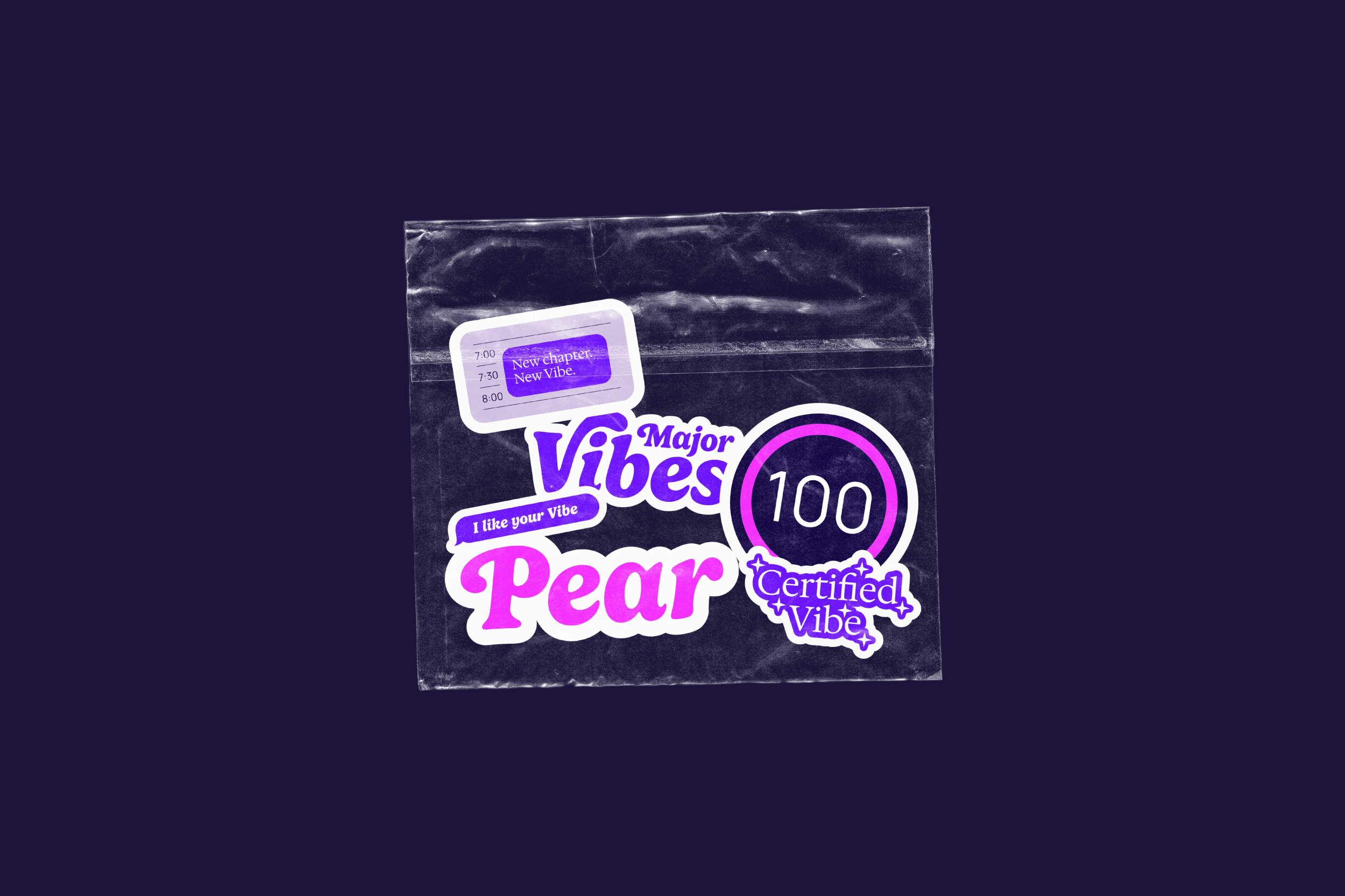
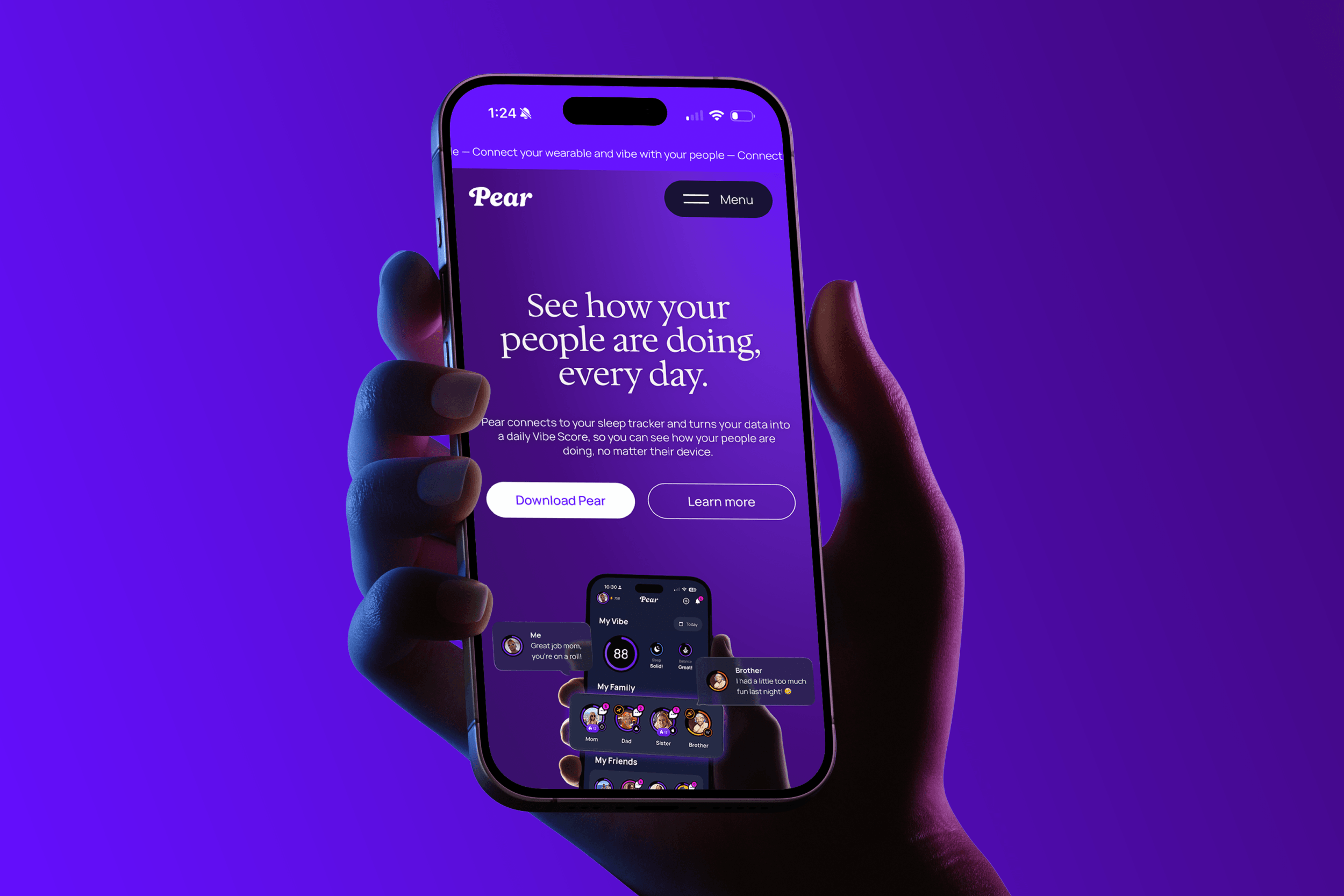
Pear was built to fix that. A social wellness app that connects wearable users – across Apple Watch, Oura, Whoop, Garmin, Fitbit, and beyond – through a single, unified daily score called the Vibe Score. It strips overnight health data down to something you can actually share with the people you care about. No stat wars, no biohacker jargon. Just a simple daily check-in that naturally leads to better habits.
The idea is elegant. The market is wide open. And when Pear came to HRVST, they needed a brand and digital presence that could do the idea justice.
Services

- BRAND BUILDING
- Digital experiences
- Design
PEAR.APP 👉🏻
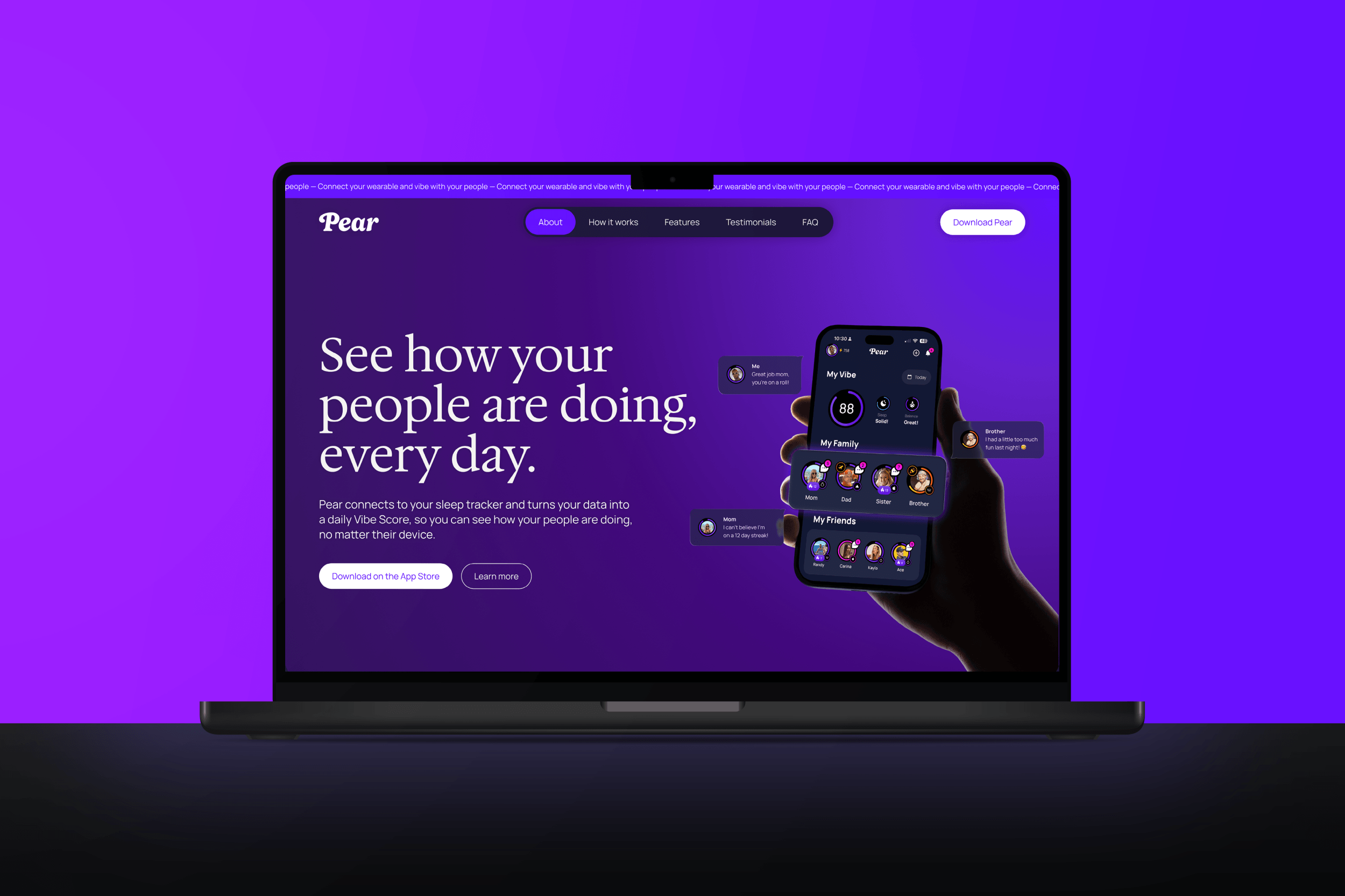
The ask.Pear was approaching its official launch on the iOS App Store. The app was in beta, early users were vibing, and investor conversations were picking up. What was missing was a brand that matched the vision – something that felt as warm and human as the product itself, and a web presence that could work as both a growth engine and a credibility asset.
The team knew exactly who they didn't want to be. Not Whoop. Not Oura. Not another clinical, data-heavy wellness brand that makes you feel like a biometric spreadsheet. They wanted Pear to feel fun, approachable, and culturally aware – the kind of brand people actually want to be part of, not just use.
HRVST came on to handle the brand and everything that comes with it – from identity and digital to the full suite of assets a growing app company needs to show up properly in the world.

The strategy.The first thing we got clear on was what Pear actually is. It's not a tracking app. It's not a health monitor. It's a community – a new way to check in on the people you care about, where the data is just the medium.
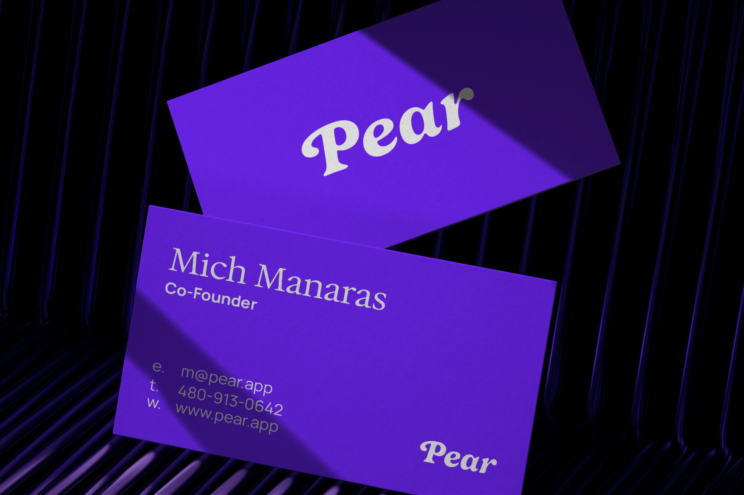
That framing shaped everything. The visual direction leaned into warmth, colour, and play without crossing into the kind of sugary, app-store genericness that plagues the wellness category. The wordmark came first – bold, script-forward, distinctive – the kind of logo that works on a hoodie as naturally as it does on a phone screen. The colour palette is rich and layered, anchored by Pear's signature purple gradient with electric accents that keep the brand from ever feeling corporate or cold. Typography pairs an editorial serif for headlines with a clean sans-serif for body copy – expressive when it needs to be, serious when it has to be, always coherent.
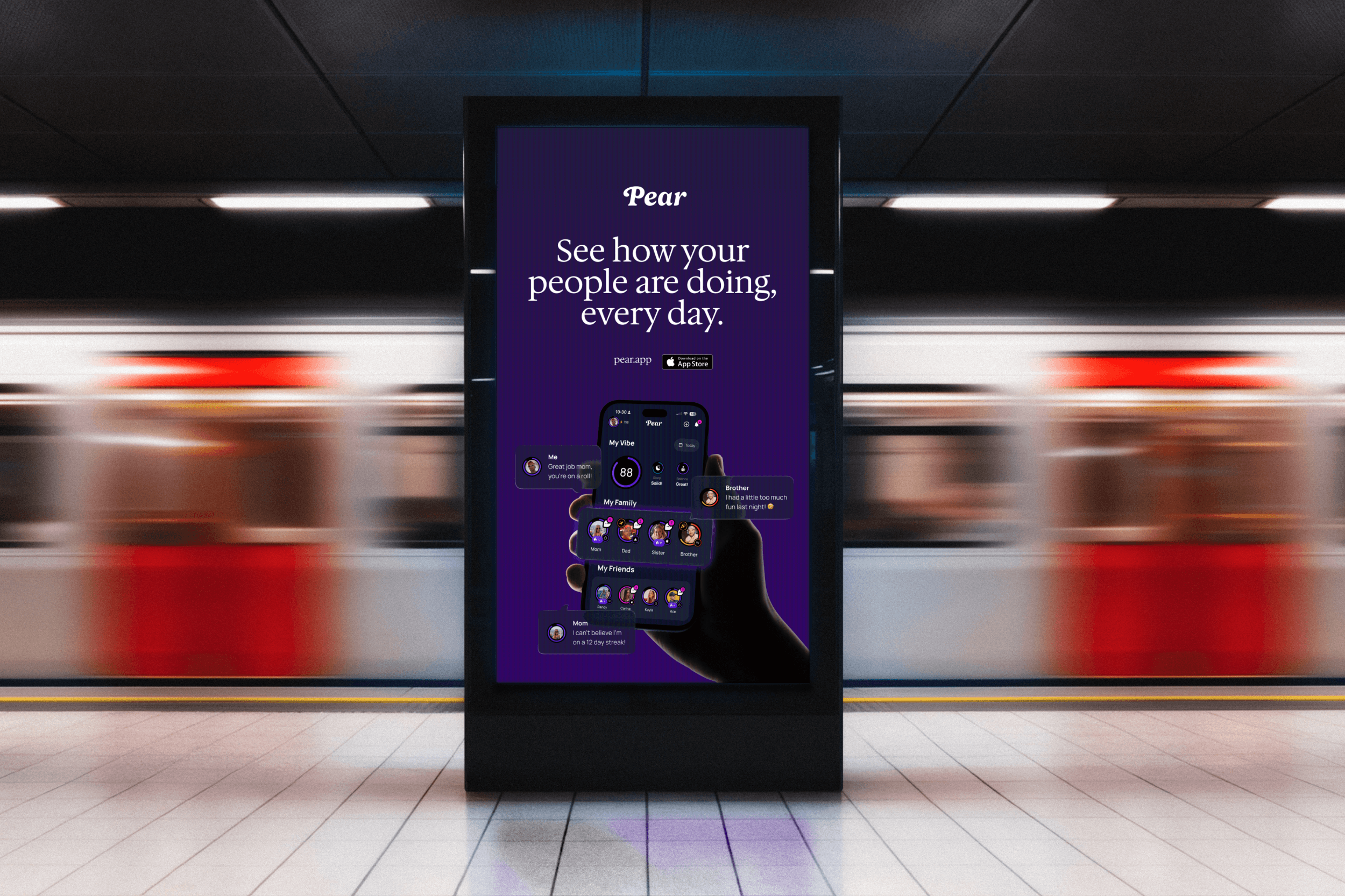
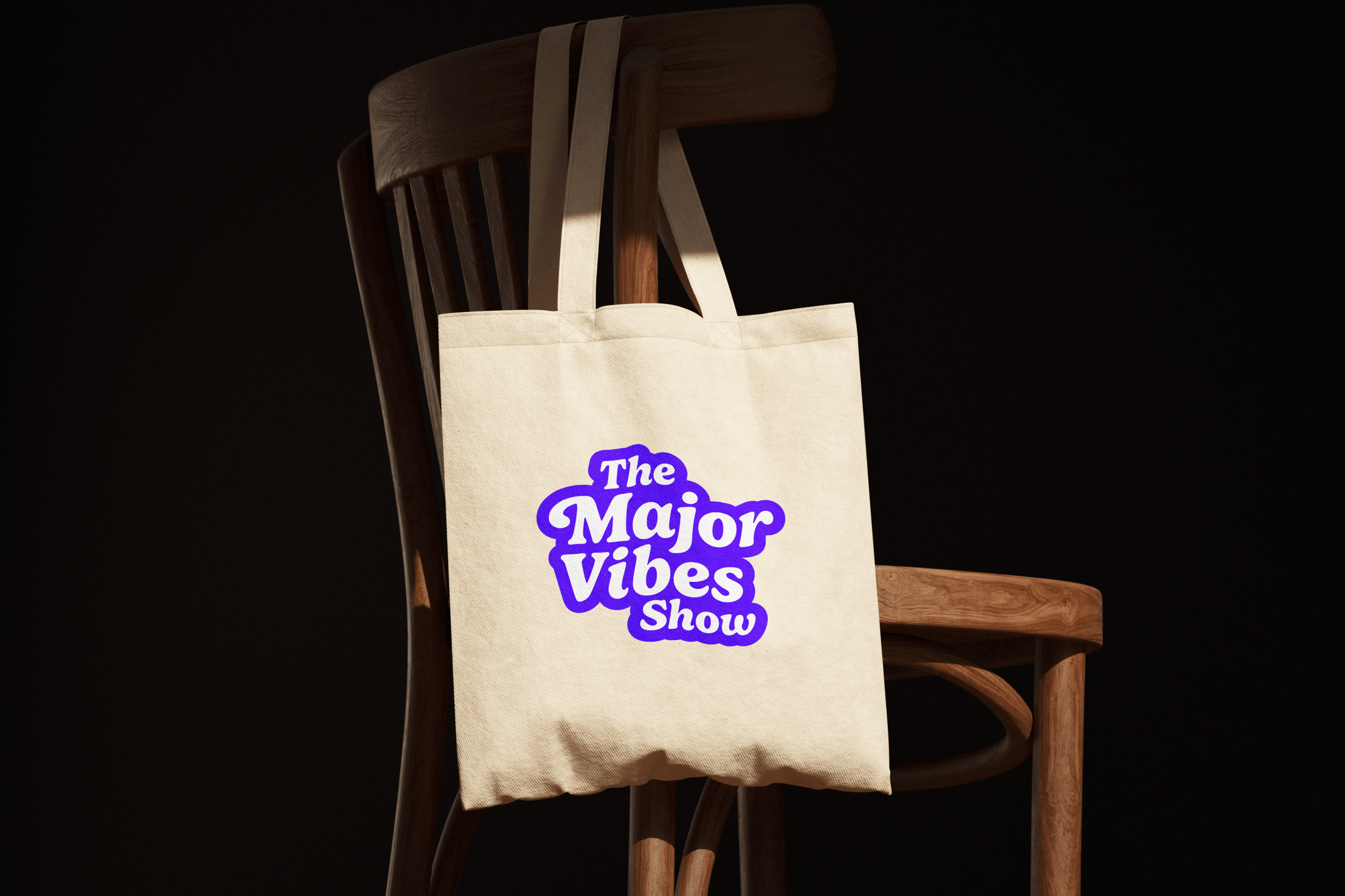
For the website, the goal was speed and clarity. Visitors needed to understand what Pear is, why it matters, and how to get it – fast. The site moves cleanly from hero to feature breakdown to social proof to download, with animated transitions that add energy without friction. Beyond the website, the brand extended into a full suite of assets – illustrations, merch, social templates, stationery, a pitch deck, and App Store banners – a complete system built to show up properly across every context, from investor meetings to the App Store shelf.
The solution.Pear launched with a brand that finally matched what the product is actually trying to do: make wellness feel good. The identity is warm, confident, and distinct in a category that tends to default to either cold precision or glossy emptiness.
The website gives the team something real to point investors, press, and new users toward – a clean, high-performing digital home that communicates the product quickly and drives toward the download. The broader brand system gives the team creative infrastructure to grow into, whether that's social content, investor presentations, merch drops, or the next version of the app.
The work positions Pear as a lifestyle brand with a product behind it – not just an app with a logo.
“
What an absolute pleasure it was working with HRVST! We did a full rebrand, logo, brand kit and website and wow did they knock it out of the park! Brandon, Katie and the whole team were so impressive to work with, I can't overstate the professionalism. Huge recommendation!
– MICH MANARAS, PEAR