Vista Properties
Private capital, public confidence.
Vista Properties has been a quiet force in the Greater Montreal Area for over 50 years – acquiring, developing, and managing over 10 million square feet of industrial, commercial and multi-residential properties. With roots that run deep, they’ve built a reputation on integrity, discipline, and long-term thinking. But like many established players, Vista’s digital presence was starting to show its age. Their visual identity no longer reflected the sophistication or credibility of the company behind it, and the website didn’t meet the expectations of today’s partners and tenants.
The ask.Vista Properties came to us to elevate their brand – not just refresh it. While their name carried weight in the Greater Montreal Area, their visual identity and website didn’t reflect the credibility, experience, or ambition that define the company today. They needed a full rebrand that modernized their image without losing the recognition they’d built over decades – especially the equity tied to their signature “V” symbol. Alongside the rebrand, Vista wanted a new website to better serve brokers, partners, and future tenants, with clear messaging, flexible listings, and a streamlined bilingual experience.
The strategy.We kicked things off with discovery sessions to understand Vista’s values, goals, and positioning – what set them apart, and how they wanted to be seen. While competitors focused on raising capital, Vista’s strength lay in being privately funded, disciplined, and quietly consistent. We built a brand around that foundation – one that feels modern, confident, and established. The new identity centred on an evolved logo that sharpened their familiar symbol into a more balanced, legible mark. From there, we rolled out a full set of brand guidelines covering typography, colour palette, co-branding, and accessibility – all built for long-term consistency.
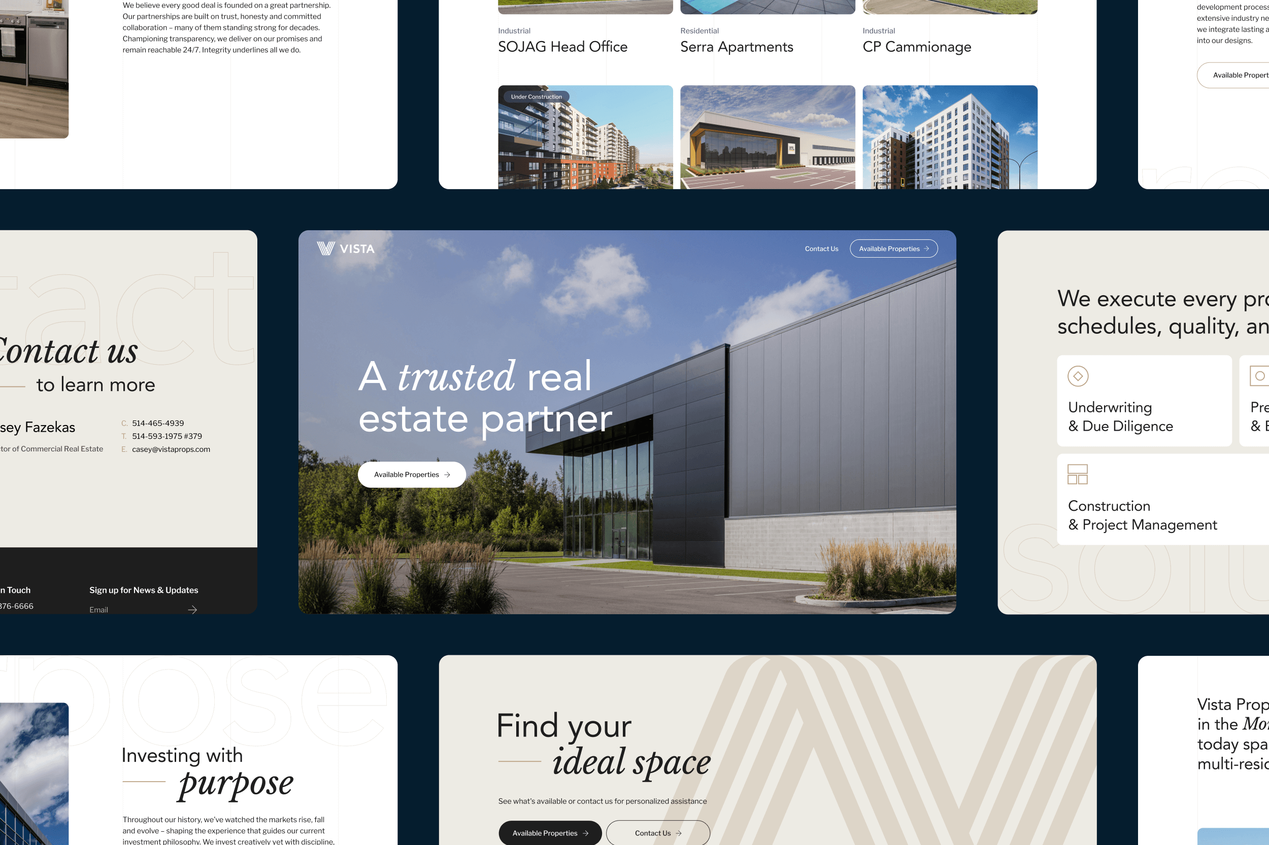
On the digital side, we designed and developed a custom site on Webflow to spotlight Vista’s properties and perspective. Our focus was on clarity and ease – reducing friction, integrating subtle animations, and making it simple for users to browse listings, explore featured projects, and reach out. We added bilingual support, Mailchimp integration, and tools for Vista to manage listings in-house. A floating CTA keeps property availability front and centre, while flexible filters and downloadable PDFs make the site a valuable tool for brokers and potential partners alike.
The solution.Vista’s new brand and website strike the right balance between experience and a more contemporary edge. Their identity now reflects the quality of work they deliver and the relationships they’ve built. The updated logo preserves recognition while introducing a more confident, refined tone. The supporting system keeps the brand consistent across every touchpoint – from signage to digital to stationery. The website positions Vista as a trusted, forward-looking real estate partner, while giving their internal team the tools to manage it all independently. Together, the brand and site create a stronger foundation for how Vista shows up, communicates, and continues to grow.
“
Working with HRVST is fun, dynamic, professional, and easy. The team helped us create a new logo and website (among other assets) that we are proud of. They understood the brief and delivered! What I appreciated most come launch was that the website was thoroughly tested and their delivery of final assets was organized and well documented, which made the hand-off to our team seamless.
– SABRINA ABERMAN, VISTA PROPERTIES


