

Great Canadian Co.
Slope style, home pride.
Nestled in the heart of Ontario, the Great Canadian Company stands as a beacon of Canadian pride, offering customizable products that celebrate the country’s unique culture and individuality. Born from a simple custom water ski sign and grown into a diverse product line, this brand has always been about more than just merchandise – it's about sharing a piece of Canada with everyone. Yet, as their product range expanded and their audience grew, it became clear that their branding needed to evolve to match their ambition and reflect the true essence of Canadian spirit.
Services- Brand building
- Design


The ask.Great Canadian Co. was thriving, with an ever-growing catalogue of customizable products that resonated with Canadians far and wide. However, their branding felt mismatched with their vibrant, bold personality and the broad appeal of their offerings. They sought a partner who could encapsulate the essence of their brand – adventurous, proud, and deeply rooted in Canadiana – into a cohesive, recognizable brand identity. They needed a branding system that was as flexible and expressive as the products they offered, ensuring they stood out in a crowded market while staying true to their core values.


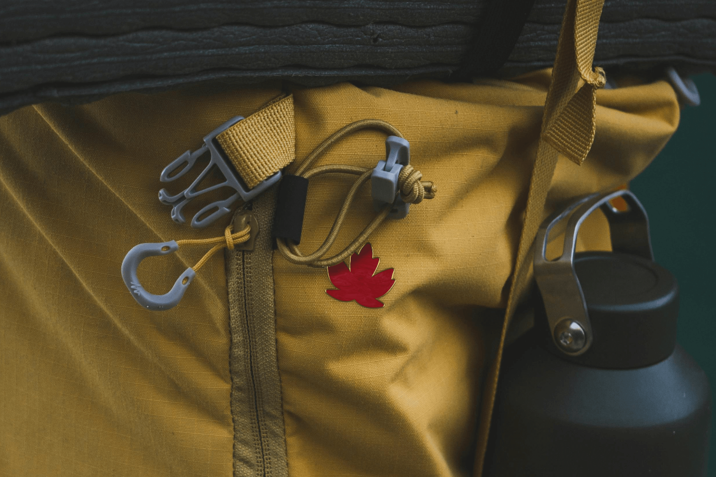
The strategy.HRVST's strategy for the Great Canadian Co. was inspired by the essence of a Canadian weekend cottage getaway, aiming to encapsulate the natural beauty and serenity of Canada's landscapes. Our selected colour palette reflects this, with hues named after iconic Canadian locales: Jasper Red, Garibaldi Navy, Fundy Green, Saskatchewan Yellow, Drumheller Beige, Baffin Island White, and Rocky Mountain Black. This concise palette captures the spirit of Canada's diverse environments, from the vibrant Rockies to the tranquil Arctic, ensuring the brand resonates deeply with the Canadian experience.
Our strategy extended beyond mere aesthetics. We developed a full branding system, including brand guidelines that outlined the use of our new logo, colour scheme, and typography to ensure consistency across all platforms. This system was designed to be as versatile as the products offered by the Great Canadian Co., allowing for the brand's personality to shine through in every touchpoint, from product packaging to digital presence.


The solution.HRVST's strategy for the Great Canadian Co. drew inspiration from Canadian weekend getaways, aiming to capture the country's natural beauty. The colour palette, named after iconic locales like Jasper Red, Garibaldi Navy, Fundy Green, Saskatchewan Yellow, Drumheller Beige, Baffin Island White, and Rocky Mountain Black, embodies Canada's varied landscapes, ensuring deep resonance with the Canadian spirit.
Beyond aesthetics, we crafted a comprehensive branding system with guidelines for logo use, colour scheme, and typography, ensuring brand consistency across all touch points. This system, reflecting the brand's versatility, lets its personality shine across packaging and digital platforms, aligning with the Great Canadian Co.'s diverse product offerings.

“
We have been fortunate to work with HRVST on our new brand identity. Partnering with a fellow Canadian brand was a no brainer but we hit the jackpot with HRVST! The team saw our vision and immediately jumped on board to create a new consistent identity our customers will see for years to come.
– Kristen Grasse, Great Canadian Company